
Wall colours are more than just a design choice. They influence how you feel, think, and even how productive you are throughout the day. The psychology of colour is a fascinating area that blends design, art, and human behaviour. By understanding how different colours impact your mood and mindset, you can make smarter decisions when decorating your home or workspace.
In this guide, we’ll explore the science behind colour psychology, how individual colours affect your emotions, and tips for choosing the right shades to match your lifestyle.
Why Colours Influence Our Emotions
Colour perception isn’t just visual — it’s deeply connected to our brain’s emotional and physiological responses. Studies in environmental psychology show that colours can trigger hormonal changes, influence focus, and even affect heart rate.
For example, warm tones like red and orange can feel energising, while cool tones like blue and green often create a sense of calm. This means the colour you choose for your walls can actively shape the way you experience your space.
The Science of Colour and the Brain
Our eyes translate colours into electrical signals that the brain interprets. This process activates certain regions associated with emotions and memories. For instance, blue might remind you of the ocean and evoke relaxation, while yellow could spark feelings of warmth and happiness.
Understanding these associations helps you design rooms that enhance — rather than disrupt — your desired mood.
Warm Colours: Energy and Excitement
Warm colours like red, orange, and yellow are often linked with vibrancy, social connection, and stimulation. These shades can make a room feel lively and inviting, which is why they’re popular in kitchens, dining areas, and creative spaces.
However, they can also be overwhelming if used in large doses, so it’s important to balance them with neutral tones.
Red: Passion and Alertnes
Red stimulates energy and excitement, making it ideal for spaces where activity is encouraged. It can also raise your heart rate and blood pressure slightly, which is why it’s commonly used in gyms or social areas.
Still, too much red can feel aggressive, so consider using it as an accent wall rather than covering an entire room.
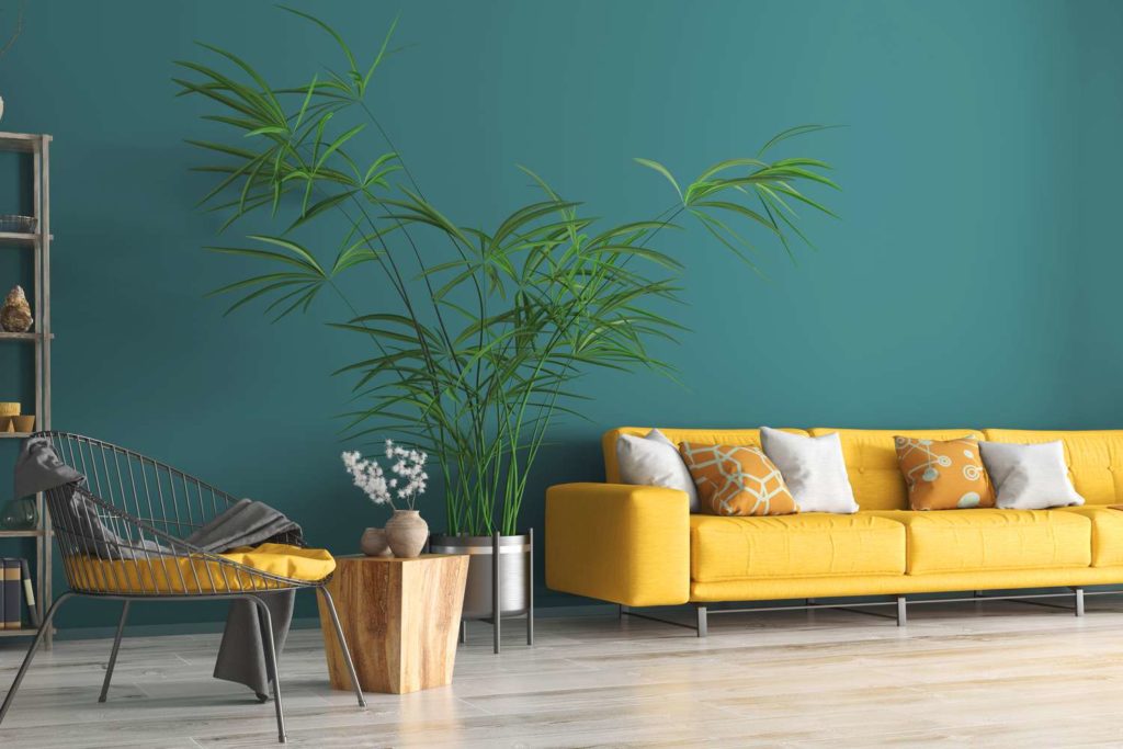
Yellow: Optimism and Warmth
Yellow is often associated with happiness and creativity. It’s a fantastic choice for kitchens, home offices, or playrooms where you want to boost positivity.
That said, overly bright yellows may cause restlessness, so softer, buttery shades work best for long-term comfort.
Cool Colours: Calm and Focus
Cool tones such as blue, green, and purple are linked with tranquillity and focus. They are excellent for bedrooms, bathrooms, and workspaces where you want a sense of clarity and relaxation.
These shades often create the perception of more space, making them ideal for smaller rooms.
Blue: Peace and Productivity
Blue is one of the most universally liked colours and is known for reducing stress levels. Light blue shades promote calmness, while deeper blues help with focus, making them perfect for offices or study areas.
Green: Balance and Renewal
Green brings the essence of nature indoors, creating a balanced and refreshing environment. It’s especially effective in living rooms and bedrooms, as it reduces eye strain and encourages relaxation.
Neutral Colours: Versatility and Timelessness
Neutrals like white, grey, and beige form the backbone of many interiors. They create a clean and adaptable backdrop that works with any accent colour.
Neutrals are especially useful if you enjoy changing your decor often, as they allow flexibility without clashing.
White: Freshness and Simplicity
White walls can make a room feel open, bright, and airy. They are perfect for creating a minimalist or Scandinavian-inspired aesthetic. However, pure white can sometimes feel sterile, so adding warm lighting or textured decor helps soften the look.
Grey: Sophistication and Balance
Grey offers a modern and calming feel, especially when paired with bold accent colours. It’s a great choice for living rooms and offices where you want a balance between style and serenity.
How to Choose the Right Colour for Each Room
Choosing the right wall colour isn’t just about personal preference — it’s about aligning your space with its purpose. Before selecting a shade, consider how you want the room to feel and function.
Match Colour to Activity Level
Rooms that see a lot of movement and conversation, like kitchens and dining areas, benefit from energising warm tones. On the other hand, bedrooms and reading corners thrive with calming cool shades.
Consider Lighting Conditions
Natural and artificial lighting can dramatically change how a colour appears. For example, a soft beige might look warm in daylight but cooler under LED bulbs. Always test paint samples before committing.
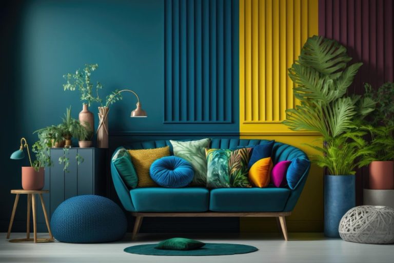
The Role of Accent Walls in Mood Setting
If you love bold colours but don’t want to overwhelm a room, accent walls are the perfect solution. They allow you to enjoy the psychological effects of strong colours without dominating the space.
Balancing Bold and Subtle
For instance, a deep teal accent wall can bring sophistication to a neutral living room, while a bright yellow feature wall can add cheer to a modern kitchen.
Read Also : Indoor Plants and Better Sleep: Can Greenery Help You Rest More Soundly?
Final Thoughts
The colours you choose for your walls are far more than a style statement — they’re a tool for shaping your daily life. By understanding colour psychology and applying it strategically, you can design spaces that make you feel happier, calmer, and more productive.
Whether you go for energising reds, soothing blues, or timeless neutrals, the key is to create a space that reflects both your personality and your needs.